Brand book
How Gornitsa looks
Linen, red and spruce thread, the cross-stitch and a calm order. Everything on this page is drawn from the site’s own styles, so it always matches how the site really looks.
Mark
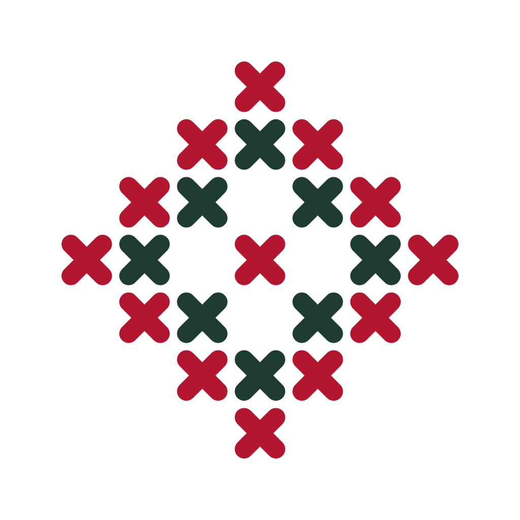
A diamond of cross-stitches
Twenty-one stitches on a 7 × 7 grid: the outer diamond and the centre in red, the inner diamond in spruce green. It is both an embroidered motif and the window of a bright room. The mark is never rotated, stretched or recoloured.
Colours
Cloth and threads
Linen and paper are the cloth, ink is the text, and red, spruce and flax are the threads. Red is used sparingly: one or two things and one main button per screen. Switch your phone to dark mode and the page shows the evening threads.
--linenBackground: 70–80 % of the area--paperCards, panels, the embroidered band--inkMain text--ink-softCaptions and secondary text--kumachMain action and accent--spruceSecond colour of the mark and ornament--flaxDecoration only, never text--lineBorders and dividersTypefaces
Kurale and Onest
Both are under the free SIL Open Font License and are served from our own server, with no requests to Google.
A bright room for good games
Pick a thread and fill in the numbered cells. The game saves itself, and everything except playing with friends works offline.
Regular 400Medium 500Semibold 6000123456789 ₽
Ornament
The stitch and the band
The cross-stitch is the unit of every drawing: two short lines with rounded ends inside a square cell. The mark, the embroidered band and the pattern on the home page are all made of stitches. Ornament decorates edges and never sits under text.
Interface and voice
Calm and to the point
One main button per screen, large touch targets, thin lines instead of shadows. We talk to players like a host welcoming guests: plainly, warmly, without exclamation marks.
| We don’t write | We write |
|---|---|
| Oops! Something went wrong :( | Couldn’t save. Free up some space on your phone and try again. |
| Are you sure? This action cannot be undone. | Delete your profile? Your nickname and online games will be removed from the server. Games on this phone will stay. |
| Your request has been registered under number 4471. | Thanks for writing. It looks like a sound setting — here’s how to fix it. |
Things and print
A mark you can stitch
The mark is a ready-made embroidery chart: a 7 × 7 grid of red and spruce cross-stitches. When the studio needs things — for Votchina tournaments and test participants — they will be a sticker and an embroidered patch with the mark on linen, a tournament card and table, and a chart for stitching the mark yourself. Every participant gets the same, it isn’t a prize. The studio doesn’t sell merchandise.
| Item | For whom | How |
|---|---|---|
| Sticker | Players in Votchina tournaments, closed tests and meetups | A linen-coloured circle or square, the mark in the middle with a clear space of one cell; no text, or the name “Горница” under the mark |
| Embroidered patch | People who helped a game: testers, tournament judges | The mark is itself an embroidery chart: 7 × 7 red and spruce cross-stitches on unbleached linen; at 4 mm per cell it’s about 28 mm across |
| Card and tournament table | Clubs that run Votchina tournaments | Linen-coloured paper, printed in two inks (red and spruce) or one; the embroidered band along the edge |
| Embroidery chart of the mark | Anyone, free | A 7 × 7 chart and a thread list — “stitch it yourself” |
| Bag or T-shirt | Later, if people ask for them | Unbleached linen or cotton; a small mark on the chest or in a corner, or the band along the hem |
Rules for things
- Ground — linen, unbleached fabric or paper. On dark fabric, only the single-colour mark in white; the same mark for embossing, stamps and one-ink printing.
- Colours — red and spruce, as on this page. The brand has no print numbers (CMYK, Pantone) yet: the first run is matched by eye against a sample on linen, and the chosen numbers are then written into the brand book and kept.
- Artwork — only from the mark files (below, “Files”), never redrawn; the name “Горница” is set in Kurale. No English slogans, and no QR code bigger than the mark.
- Never — gold, gloss or foil; nesting dolls, balalaikas, bears or fake-antique styling; characters from other people’s games and cartoons; AI-generated images.
- Game characters — the Skazy heroes, the Uzory patterns — go on things only by the studio’s decision and only drawn from the game’s own artwork: they are the game’s look, not the studio’s mark.
The rules in full
This is the whole studio brand book. The colours, type, mark and ornament above are shown straight from the site’s styles; below are the rules for using them. The rules for games are the studio’s proposal: each game has its own look, and its art director may depart from them.
The idea: a bright room for good games
A gornitsa is the clean, bright room of a Russian wooden house where guests were welcomed. The brand draws on three images from that world.
- Linen — bleached cloth as the ground for everything: light, quiet, plenty of air.
- Thread and cross-stitch — embroidery as the unit of drawing: the mark, the ornament and the canvas cells are all built from cross-stitches. Red (kumach) and spruce threads lead; flax thread is for decoration.
- Order — like a gornitsa, where everything has its place: an even grid, a calm rhythm, nothing extra on screen.
What the brand never uses: fake-antique curlicues everywhere, gold and gloss, nesting dolls, balalaikas, bears and other souvenir clichés, neon and acid “gamer” colours, glossy 3D buttons.
Name
- In Russian — Горница, written in text as студия «Горница» in «guillemets» and declined as a normal noun.
- In English — Gornitsa (Gornitsa Studio), without quotation marks.
- In the logo the name is set in Kurale with a capital first letter, no letter-spacing and no all-caps.
- Domain — gornitsa.games; game package names —
games.gornitsa.<game>.
Mark
- Mark and name (as in the site header): the mark on the left, the name “Горница” in Kurale on the right; the mark is about the height of a capital letter including descenders, with half the mark’s width between them.
- Clear space — one cell of the mark’s grid (1/7 of its width) on every side.
- Smallest size — 16 px, as in a browser tab; any smaller and the stitches run together.
- Ground — linen or paper; on dark grounds the mark takes the dark-theme colours. On photos and busy pictures, only on a linen-coloured panel.
- Single colour — where two colours aren’t possible: embossing, one-ink printing, watermarks. The colour is ink, red or white.
- Never rotate it (the diamond stands on its point), stretch it, swap the thread colours, add shadows, outlines, gradients or depth, draw the stitches in another shape, or put the mark inside a game icon.
Colours: roles and contrast
| Colour | Role | Rule |
|---|---|---|
| Linen | Page and screen background | The main area: 70–80% |
| Paper | Cards, panels, the embroidered band | Slightly lighter than the background: separates without shouting |
| Ink | Main text, interface icons | Not pure black |
| Soft ink | Secondary text, captions | At least 7 : 1 contrast with the background |
| Line | Borders, dividers | Thin lines, 1 px |
| Cell | Empty canvas cell, inactive elements | Only for cells and placeholders |
| Red (kumach) | Main action, accent, focus, the cross-stitch list marker | One or two things per screen, one primary button |
| Spruce | Second colour of the mark and ornament, a quiet accent | Not for action buttons |
| Flax thread | Decoration: fine ornament, trim | Not for text in the light theme (contrast 2.6 : 1) |
Text contrast: ink and soft ink on linen and paper — at least 7 : 1; red on linen — 5.8 : 1 (fine for text from 17 px and for buttons); white on red — 6.8 : 1. The dark theme is checked the same way. Exact colour values for both themes are in the tokens file (below, “Files”).
A game’s own palette adds to these colours rather than replacing the interface: Skazy adds ochre, blue, soot, white and a little gold to the threads, Uzory adds its embroidery-thread palette. Buttons, dialogs, menu backgrounds and text in games use the studio colours.
Type
- Kurale — headings, game names, the studio name, quotations. Weight 400 only, from 21 px up. Not for buttons, captions or body text.
- Onest — everything else: text, buttons, captions, numbers. Weights 400, 500 and 600; figures in columns are tabular.
- Both fonts are under the SIL Open Font License. The site and the games serve them from their own server; for print, get them by name from any free-font catalogue.
- Body text uses the middle step of the type scale with 1.6 line spacing; headings use 1.12 line spacing with balanced line lengths.
- A game may have its own display face — for example for the titles of tales — by its art director’s decision; the interface stays in Onest.
Ornament and canvas
- The cross-stitch is the unit of drawing: two short lines with rounded ends at 45° inside a square cell with margins.
- The embroidered band is a strip of red and spruce cross-stitches on paper between two thin lines. On the site it sits above the footer; in games, in “About” and on section screens, never more than one band per screen.
- The canvas is a field of cells with thin gaps, where a picture can be “stitched”, as on the site’s home page and in Uzory.
- Ornament is drawn in code, on a grid, from geometric motifs of northern Russian embroidery: diamonds, fir-trees, crosses, steps. No symbols whose meaning we can’t explain and check against a source.
- Ornament decorates edges, never backgrounds: text never sits on a pattern.
Pictures
- Flat and drawn in code. Fills without shading, a crisp outline or none, a limited palette. Game characters and objects are drawn in code from parts.
- Photographs — only our own or public-domain ones, with no fake-antique filters and no close-ups of present-day people.
- Never — AI-generated images, stock pictures, 3D renders, gloss or casino-style gradients.
Interface
- Corner radii: buttons and fields — 6 px, cards — 10 px, tags and thread pickers — fully round. Shadows are almost never used: surfaces are separated by the paper colour and a thin line.
- The primary button is red with white text; the secondary one is transparent with a border. One primary button per screen.
- Keyboard focus — a 2 px red outline with an offset.
- Touch targets are at least 48 × 48: big buttons are part of the promise that a grandmother can play.
- Calm motion: short transitions with no springs or shaking; when animation is turned off on the phone, the games and the site keep still too.
- Our own calm confirmation dialog in the studio colours instead of the system one.
How the games wear the studio brand
Each game has its own look: Votchina — board-game cards, Long Nardy — board and dice, Anamnesis — a calm hospital, Skazy — Russian folk prints and Bilibin, Uzory — embroidery. The studio brand is what they share.
- Interface — background, text, buttons, dialogs, menus — in the studio colours and in Kurale and Onest.
- Cross-stitch and thread — list markers, the embroidered band, colour pickers — wherever they suit the game.
- “About” — the studio mark, the line “A game by Gornitsa studio”, gornitsa.games and support@gornitsa.games, the embroidered band.
- Store listing — developer “Горница”; the description is written in the studio’s voice.
- Game icon — no studio mark and no text: one large recognisable object from the game, drawn flat on linen, paper or the game’s own colour; no gradients, frames or highlights. All the icons side by side look like one family.
- Store screenshots — real game screens; captions in Onest on a band of linen or paper at the top; no invented interface and no exclamation marks.
- Cover on the site — a picture of the game’s world with no lettering: no title, no slogan, no buttons — the name sits next to it as text. 3 : 1, from 1920 × 640; everything important stays in the middle 2 : 1, since phones crop the edges. The same flat drawing as in the game. The banner with the name stays for the home-page card and social links.
- No logo splash screen at launch: the game opens straight away, and the studio introduces itself in “About”.
Client projects
A project in a client’s brand takes the client’s name, colours, type and voice. All that remains of Gornitsa is one line in “About” — “Made by Gornitsa studio”, if the client agrees — and our rules on player data, content and money.
Files
- Mark, SVG — in the brand colours, for screens and two-ink print.
- Single-colour mark, SVG — the colour is set where you place it: embossing, stamps, dark fabric.
- Mark, PNG 1024 × 1024 — on a transparent background, clear space included, for anyone who doesn’t work with SVG.
- Site icon, SVG — the mark on linen.
- Wallpapers for phones and computers — the mark, a towel, a canvas and a tablecloth, light and dark, PNG.
- Tokens, CSS — exact colour values for the light and dark themes, fonts, type scale and corner radii.



Writing about our games? Email press@gornitsa.games and we’ll send screenshots and answer your questions.
Who we are and what we promise players is on the About page.